Choosing a builder went hand in hand with choosing a house layout that would fit on our block. We have a diagonal frontage, as our property is located at a kink in the road. Unfortunately, this caused some challenges for house placement due to the minimum setback requirements of our local council. These dimensions meant that our house had to be built further back from the front of the property. As a result, it wasn’t possible for us to build any of the longer house designs.
We scoured the internet and investigated every volume builder in Adelaide – first searching for plans that would fit on our block, and then determining whether we liked the layout. The block constraints were extremely limiting. There were less than 5 designs we liked which incorporated the wider frontage and shorter length.
We wanted a house that had the following features:
- Two-storey to maximise the indoor and outdoor living spaces
- 3+ bedrooms
- Open plan living/dining/kitchen area
- Upstairs living area with a balcony located at the front of the house
- Straight staircase
- Downstairs gym area
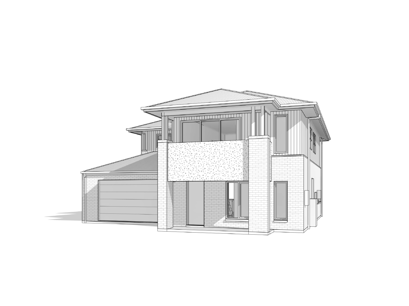
The design that resounded with us the most, that would also fit our block footprint, was the Winchester by Metricon.
We really liked Metricon’s designs in comparison to many of the other volume builders’ display homes that we visited. The layouts seemed to flow better and the designs often cleverly incorporated voids and niches to create a more premium feel. Many of the competitors display homes were similarly appointed in the quality of the finishes. However, it was these little design features which helped to improve the perceived quality of their homes.
We went through a series of iterations to adapt the design to our liking. At the same time, we were playing with the cost of interior design features to try and minimise any surprises to our budget during the selections phase. In hindsight, although we spent a lot of time optimising this, we were a lot more prepared for the selections process.
Source: Winchester Design by Metricon
The features we loved in the design include:
Open Plan Living Area – The large open plan living area connecting the kitchen, dining and living was a winning feature. We enjoy entertaining and wanted an open space that could cater for many people. We did not want to close off the kitchen from these areas as it is a hub of activity in our household.
Downstairs Living area – We wanted a downstairs living area for multiple reasons. The first being that we wanted to be able to open out into a courtyard at the back of the house for entertaining, especially during the summer. We also wanted to avoid lugging grocery shopping to the top floor and lugging bins and rubbish downstairs.
Straight Stairs – As you enter the house, we have a long corridor which connects the entrance to the living area. We decided that straight stairs was a non-negotiable for us. Anyone who has lived in a two-storey house with U-shape stairs knows the challenges of moving furniture upstairs. U-shape stairs are a great space saving feature, but they just weren’t for us. The original design had the base of the stairs close to the entrance door. However, we decided to reverse it so that the base of the stairs was located at the living area end.
Why? We wanted to encourage people returning home to enter the living area first before they go upstairs. Similarly, when going downstairs you must pass through the living area. Maybe we were future-planning so that teenagers couldn’t sneak out unbeknownst! Reversing the design also adds the feeling of security and promotes social interaction in the house.
The stairs would be the first thing you would see upon entering the house. So, we decided to avoid closed in MDF stairs and instead chose an open design to allow the corridor to feel more spacious and let light through.
Kitchen – We loved Metricon’s kitchen and adjoining butler’s pantry. Whilst we can’t afford a butler, especially after this build, we liked the idea of hiding our fridge out of sight to maintain the clean lines of the kitchen doors. We also liked the idea of being able to put dirty dishes and pans out of sight when entertaining. Another feature we chose to incorporate was the splash back windows. Whilst it remains to be seen how they go for cleaning, they do allow for the connection to the outside and creating a more open space.
Powder Room – The original design only allowed for a downstairs WC. However, given that we are by the beach we chose to incorporate a shower downstairs as well. We figured that if people didn’t want to use the outdoor shower, then they could utilise the downstairs one. This helped us completely separate the upstairs and downstairs bathroom areas. Plus, if we are in this house when we are older or we break our legs, then we can always sleep and shower downstairs!
Sitting Room – Our final downstairs feature is the front sitting room. Many people want home theatres, home offices or a second sitting room. Not us! We needed a gym. In our previous house we had a gym within our house, rather than within the garage. And we found the psychologically ease of accessing an inside gym actually increased our usage. This was a must have!
Entrance Door – We believe that first impressions count and increasing the size of our entrance door was a worthy upgrade investment. However, to balance costs, we didn’t opt for a panel tilt door. Whilst we both love the door side panel lights as a feature, we felt that they compromised security. As such, chose not to incorporate them in our design.
Upstairs Layout – We chose to completely change Metricon’s upstairs layout. Why? Like many designs the upstairs bedroom was at the front of the house and had a balcony. We haven’t seen many people use their bedroom balconies. We wanted the balcony to capture any potential sea views, but more importantly, we wanted it to get used. To make sure this a reality, we placed the living room at the front of the house with access to the balcony.
Another neat feature of this revised design, due to the reversal of the stairs, was that the first room you enter is the upstairs living room with the balcony. So even if we did invite guests upstairs, there is still a layer of perceived separation and a boundary from the private living areas (bedrooms and study).
We still wanted a 4-bedroom house with one of the bedrooms to become our study. We also modified the bathroom and ensuite layouts to take advantage of light and reduce glass where possible.
The other layout structural features which we added included:
- Ground Floor
- 2700mm ceiling height
- 2340mm door height
- House extended by 840mm to incorporate powder room shower and pantry refrigerator
- Garage
- Extended garage to boundary
- Drive through garage with rear roller door
- Entrance
- Flattened wall at front of house
- Dining
- Moved rear door away from centre of house towards kitchen
- Changed rear door to a stacking sliding door
- Family
- Larger window to balance out stacking sliding door
- 1st Floor
- 2550mm ceiling height
- 2340mm door height
- Master Bedroom
- Moved further back and to the side
- Extended over garage to increase size
- Ensuite/WIR
- New layout (his/hers walk through wardrobe)
- Open layout ensuite
- Large window for light
- Bathroom
- Change layout to include walk behind shower and toilet